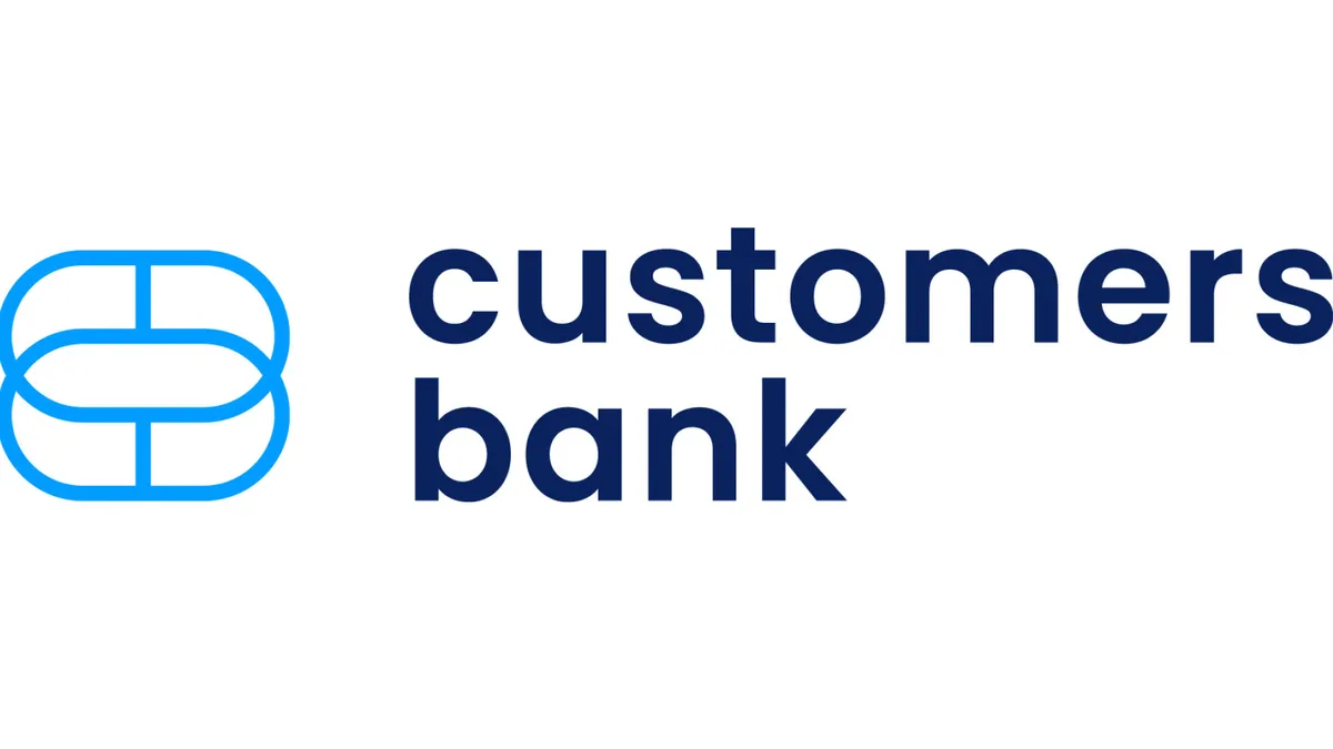
Pennsylvania-based Customers Bank unveiled new branding Thursday, a design the $19 billion-asset lender said is a reflection of its evolution as a technology-focused financial institution.
The rebrand, which includes visual changes to the company’s logo, website, mobile app and offices, follows the bank’s growth over the past two years, which includes new products and geographic expansion, Customers said.
Amid the pandemic, the bank has become a prolific Paycheck Protection Program (PPP) lender, facilitating roughly 347,000 of the government-backed loans totaling $10 billion.
The bank has found success allowing other financial institutions to white-label the PPP platform it built in-house, giving other lenders access to its technology for PPP loan origination, funding and forgiveness.
The bank has also taken a major step into the cryptocurrency space, joining trailblazers Signature Bank and Silvergate Bank in offering banking services to digital-asset institutions.
The company announced last month it had partnered with around 20 cryptocurrency clients, including Genesis, Blockfills, GSR and San Francisco Open Exchange. The business has helped the firm net $1.5 billion of zero-cost deposits since the beginning of October.
Customers said the recent growth has helped it expand beyond its Northeast geographic footprint to include new markets such as Texas, Florida and the Carolinas.
"As a result, the executive leadership undertook a complete rebranding to reposition the bank as a fintech-forward-focused banking institution that provides commercial and consumer clients the stability, regulatory and trust inherent in working with an established bank," the bank said in a statement.
The bank’s new logo does away with the red, white and blue theme and the American flag, a feature Customers Bank Executive Chairman Jay Sidhu said served the bank well in the past.
"It clearly represented the American Dream and our emphasis on assisting the challengers, small business owners and entrepreneurs to punch above their weight class to achieve their financial and growth objectives," he said in a statement. "We will always hold American values, democracy, and heritage closely in our hearts. But as an emblem of a fintech-forward financial institution with a national reach, we need to signal markets, investors, and clients that we have a modern look, feel and discipline."
New clients attracted to the bank are "younger, more diverse, more tech savvy, and looking for a different customer experience," Customers said, adding the new branding is "designed to capture this vibe."
The new logo features two overlapping blue rings, which the bank said represents its goal to connect to customers and provide highly personalized service.
"Even if the image is rotated, the connection remains, which perfectly embodies Customers Bank's new brand," the bank said.
Customers, which declined to share how much it is investing in the rebranding effort, said a revamp to its mobile app is underway.
The bank plans to convert its branches to the new signage in the coming months, adding the timing is dependent on supply-chain issues.


